Day 1940 / Better Posters notes
The book by Better Posters’s author is freaking awesome. Short summary follows, not copypasting too much because copyright, but the book is 12/10.
Chapter 1: short form
TL;DR how to do a poster if you read only one chapter
- Three columns, margins around them and between them at 50mm
- so 8 inches/200mm for the margins toatl
-
take the width of your paper, subtract 8 inches (200 mm) for the margins,
and divide by three to find your column width. If your poster is 48 inches (1,220 mm), your columns will be 13⅓ inches (340 mm) wide. Yes, it’s an awkward number, but computers don’t care.
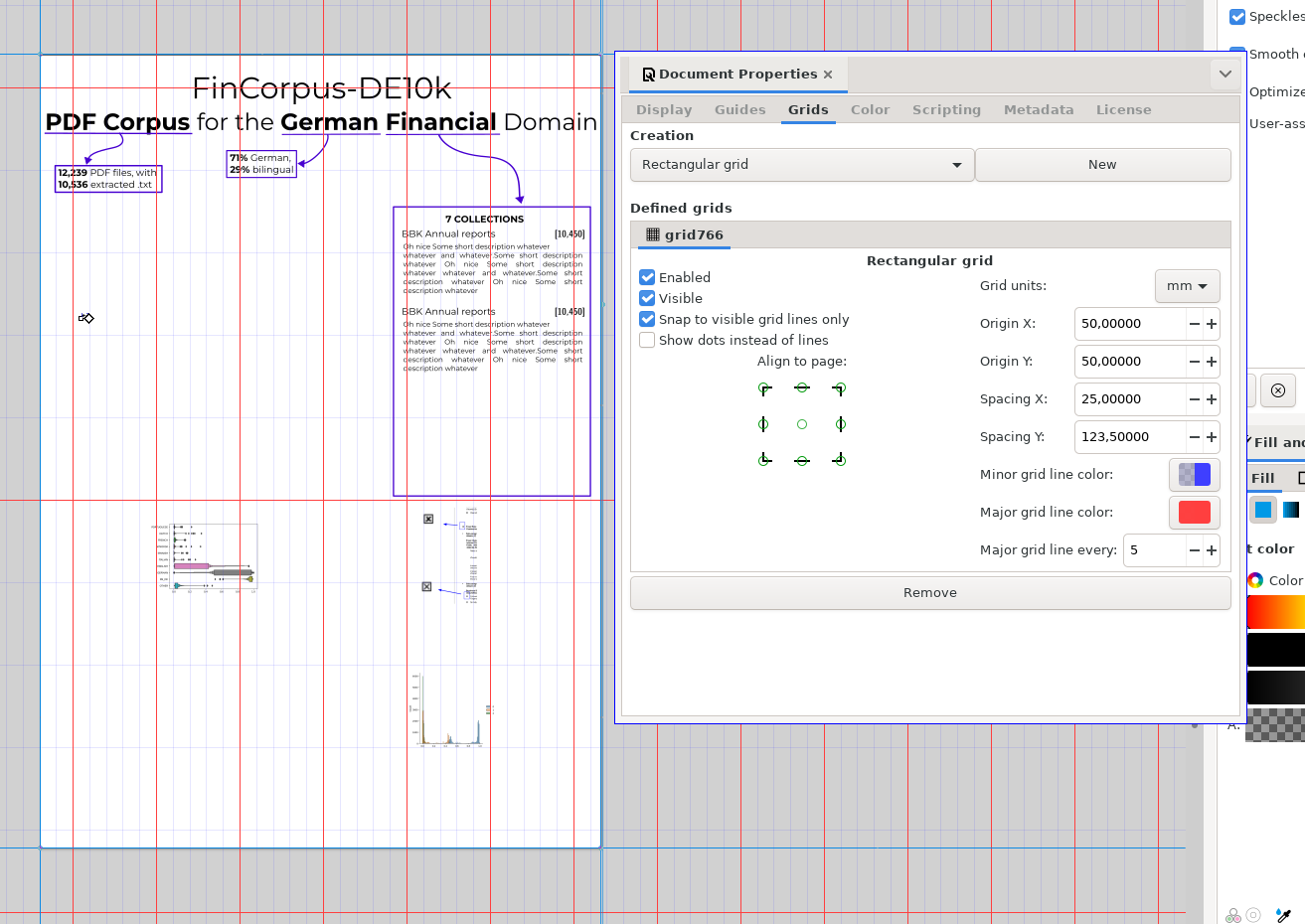
Short note to self
- A0 is 841 x 1189mm1
- Later the recommendation is 6 columns because flexibility
- So now it’s margins 50mm top/down/l/r w/ columns like this
> cc (1189-100)/6
181.5
> cc (841-100)/6
123.5
After playing around, this is good enough I guess! (Ignore Y grid)
After ignoring even more advice:
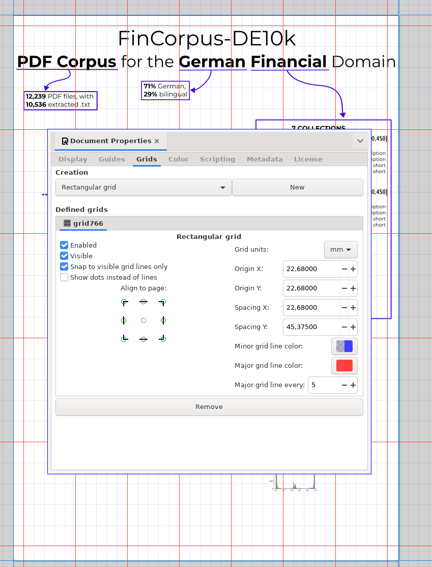 (EDIT: oh damn it’s 7, not 6!)
Bits
- To look for typos, changing the font and column size helps! p. 49
Narrative
- Narrative
- AND, BUT, THEREFORE (ABT) p.59
- We scanned the salmon AND saw brain activity BUT this is impossible THEREFORE we should …
- Find a narrative and keep it in mind when doing the poster; get other people to do their narrative and see if it’s at least close to yours
- AND, BUT, THEREFORE (ABT) p.59
Visual thinking (p.64 Chapter 7)
Quoting directly because it’s freaking awesome.
- “Dan Roam argues that there are six basic ways to show something, and you can recognize which you need by the kind of question you hear (Roam 2013)”:
- If you hear a name – a “who or what” – you need a portrait. This is not necessarily a realistic or detailed portrait like a painting or a posed photo. A stick and ball chemical structure is a “portrait” of a molecule. A smiling emoji can be a portrait.
- • If you hear a number – a “how many” – you need a chart or graph. A bar graph is a simple example.
- • If you hear a location or a list – a “where” – you need a map. Again, this need not be a literal cartographic map. Anytime you talk about something “above,” “below,” “closer,” or “overlapping,” you have the potential to create a map. Examples include concept maps, pedigrees and phylogenies, org charts and Venn diagrams.
- • If you hear a history – a “when” – you need a timeline. “Time” is one of the most common variables shown graphically (Tufte 2001).
- • If you hear a sequence or process – a “how” – you need a flowchart.
- • If you hear some complex combinations – a “why” – you need a multi-variable plot, like a scatterplot.
-
Design is making things look similar (consistency, grids, fonts) and different (h2 vs the text, etc.)
-
Main rules:
- repetition, alignment, contrast, proximity
-
p.85 100-300 dpi is the sweet spot for posters
-
108 when deciding how much to narrow/widen a line graph, aim for a max slope of about 45 degrees
-
153 a font family is designed so that different fonts look OK together — DAMN.
Grids
The most important takeaway.
- 165 “layouts that never work”
[--][ ]two wides one tall[-] [-----]swedish flag
- Numerate the order if it’s not obvious
- Vary the place of the break so it’s not squares (right?down?) but obviously rows or columns:
Bad:
[   ][    ]
[   ][    ]
Good:
[     ][  ]
[   ][    ]
Text
p.191 has a list of cliches to replace, e.g. “make use of” -> “use” and “the use of” -> (Omit)
Before you print
221 checklist and ratings
Practical bits
- Get a document tube! (And write your name on it!)
- How to do conferences shoes to stand in for hours, tacks, PDF to print it if sth happens etc.